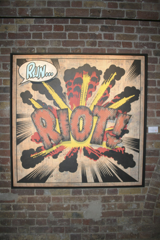
Thursday saw the doors of Black Rat Press open up for the private view of the new D*Face show entitled “aPOPcalypse Now”
Entry to the gallery was through a side door adjacent to Cargo, which let you through a multitude of weird and wonderful rooms filled with installation pieces and sounds. Eventually after clambering through the maze of D*Face imagery and silver D*Face balloons (Yes, there were free custom made ones being handed out!) you got to the gallery which was absolutely heaving with punters knocking back the drink and investing in new pieces.
We’ve put together a gallery of photos for those of you who can’t make it down, photograpy by Paul Jenkins. Full gallery after the jump…
- Tags: Black Rat Press, D*Face, Exhibition, London
13 Comments
Hullo,
I was one of the first people who got in and believe me that the bespoke silver balloon weren’t ”freely handed out”. They were just the ones not aflot, so highly collective as these are, qiuck thinking people simply scooped them up. Just wanted to straighten things up 😉
Anyone else think that D*Face’s work is obvious, regurgitated rubbish? Im glad I didnt both going to see this
I do agree a bit. I mean, we keep seeing constant pastiche of things that already exist and they’re basically churning the same thing out – Capitalism anyone? American Dream anyone?
Obviously we’ve posted this, because there are still die hard fans out there and a whole host of people who appreciate D*Face’s work – but it’s great to start an opinion thread…
Def obvious work from mr D, bit of a let-down if i’m being honest…the installation part was cool though…
Fair enough youve posted it, I agree you should post whatever comes along in the scene to give a good honest view of the current state of affairs.
This is just my personal oppinion – but I find it really annoying and lazy when people just cut up or modify someone elses artwork. Those pop art images are blatently not original, rather modified comic strips…..Infact the only bit of original work I can see there is his trademark Cloud/Hold/Spike, white and colour print thing which to be honest is rubbish……You can only get away with using logos like that if you put in some real time on the street, which is also no the case. And I also hate seeing that font hes used for the ‘N’ in call in sick (also done before)……Jesus, that font (I believe it is called Rosewood) has be played out to death, it mnight have been original 4/5 years ago but god, design your own letters if youre going to do each letter a different type of font.
Although it sounds like Im having a dig at D*Faces work (which I am) its not just him, its others (naming no names) I just wish people would put more effort into their work, I doubt any of this conceptually would stand up in the ‘real’ art world, and surely thats what people should be aiming for?
Its work like this that really annoys me about the world of street art, I can see in 5 years time when the bar has been raised, and the movement has fully grounded itself that this kind of work wouldn’t cut the mustard (I don’t believe it does now)
Thanks for the comment Mike.
We do post to give a view of the scene at the moment, but of course we’re not always posting and agreeing completely with what’s posted, hence the comments and it being open to discussion…
I do agree with you…the trouble is, that it seems that once an artist has been hyped so much, everyone wants in, whether it’s original or not. A shame really.
I can see Mike’s point, but D*Face has always been a trendsetter in certain areas, so I disagree that he’s just following suit, he was doing the whole montage thing years ago. and to be fair it isn’t street art if it’s in a gallery… the 2 don’t mix!
To be fair if people saw those images in the streets of London they’d be lovin’ them taking photos of them etc…
Positive proof that street art and galleries go together like oil and water!
Is it me or does all of this ‘art’ seem outdated!
It’s a bit pop art cliché !!!
Lichtenstein – comic books-, Warhol – silver balloons- etc….
I think he should keep his art on the street… It’s just more honest.
I think the title of the show APOPcalypse is a blatant attempt to align the artists witha an already established and over art movement.
Far from being a contemporary twist and attack on consumerism and populist imagery the exhibtion actually utilises these images to promote the artist as a brand in himself. If this was an attempt at genuine art then its a shame dface felt oblidged to put his logo into every piece.
by branding the pieces he is in essence playing ball with the mechanisms of modern consumerism that the exhibition is supposed to be putting into question,
Ben frost is just as guilty with his Crapitalism, attempting to merchandise painting that are antio consumer? that isnt irony that is straight up naivety.
surely publishing a manifesto of intent would be more usefull than churning out rooms full of more branded product.
and so on….
Hi!
Check out my graphics!!
THANKS!!
I like the balloons thats about it..:-O